Aftonbladet
User-Centered Design Study
Background
Aftonbladet is the largest digital news outlet inSweden, but their digital audience is aging. The question we set out to solve was:
How can Aftonbladet attract younger users to their website and app, when this group mainly consumes news via social media?
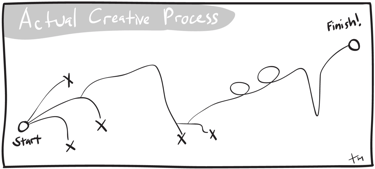
Process (Design Thinking)
Empathize
We started gathering information about Aftonbladet by doing market analysis, survey (16 respondents), and interviews (6 participants).
Results from our research showed that:
Younger users prefer short summaries and video content.
Older segment values credibility and fact-checking.
Criticism: messy layout, too many ads, constant paywalls.
Strengths: fast reporting and strong investigative journalism.
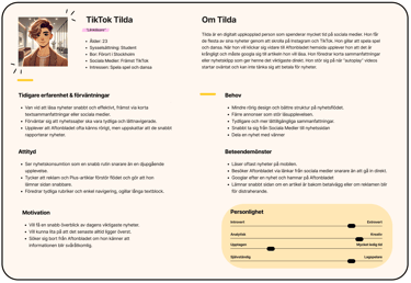
Personas
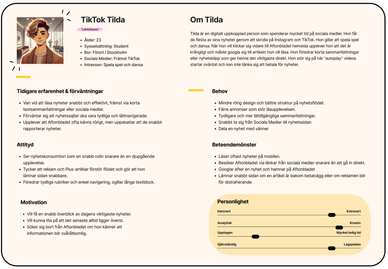
After we gathered our information about the users we made personas highlighting their needs and behaviours.
Here we see one of our personas, "TikTok Tilda", a young user who gets her news mainly from Social Media.
Expects news sites to be easy to navigate
Dislikes long text blocks, prefers video
Quickly leaves if an article is behind a paywall
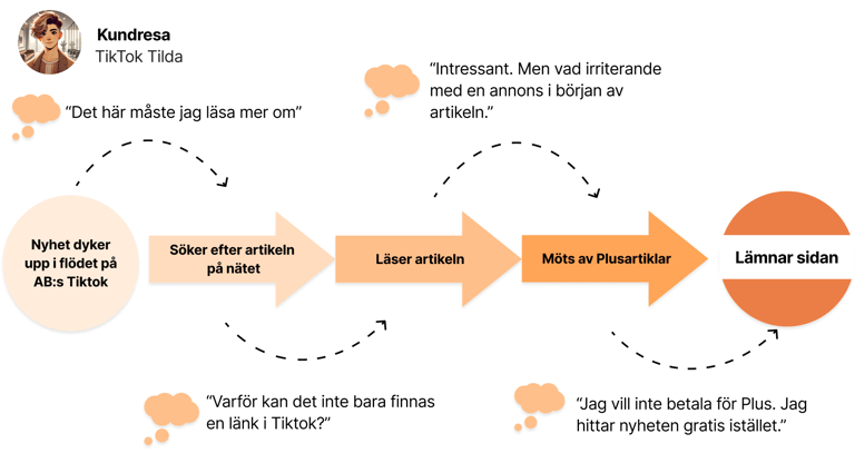
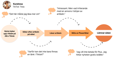
User journey
Here's one of the user journeys we did showing how our persona Tilda interacts with Aftontbladet newssite.
Ideate
Once we gained insights into how users perceive Aftonbladet, we began sketching potential solutions. Some of the key concepts included:
“Aftonbladet Social” – a clear bridge between social media and the website.
A redesigned homepage with more negative space, grouped articles, and related content.
Central placement of “Aftonbladet Direkt” to highlight breaking news updates.
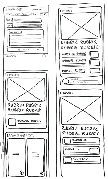
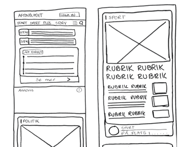
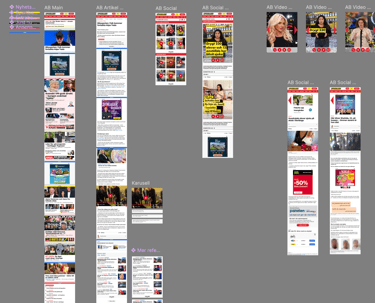
Prototype
After we decided on what concepts we wanted to focus our efforts on we made two different prototypes.
Testing
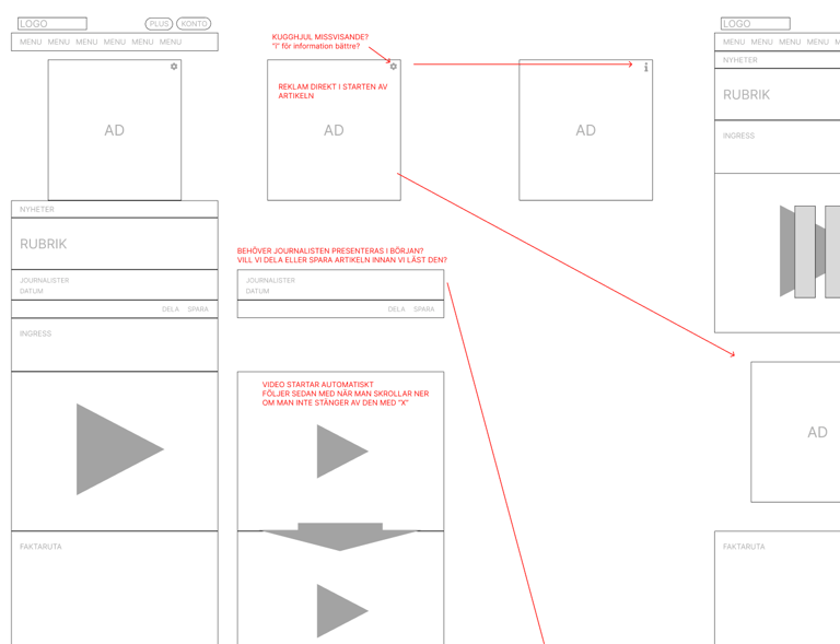
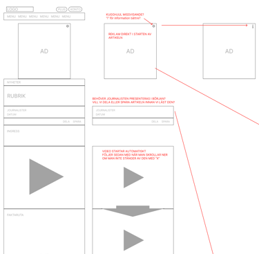
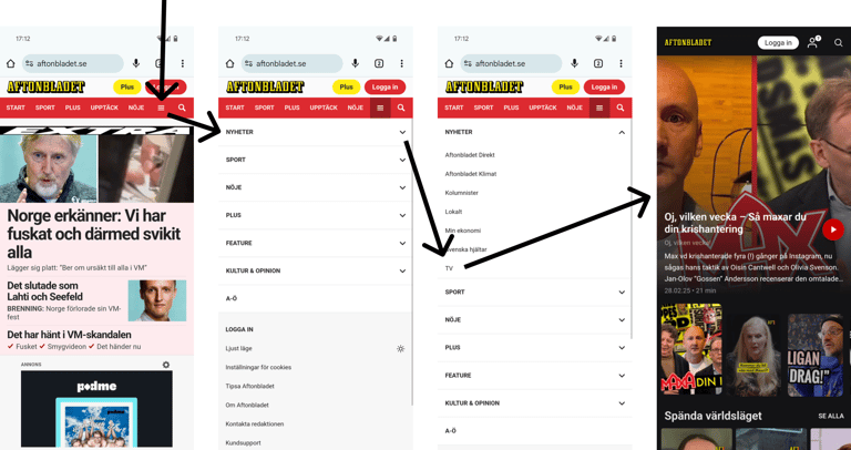
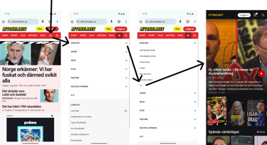
After the prototypes were made we needed to test them to see if these solutions really was something that was a improvement or not.
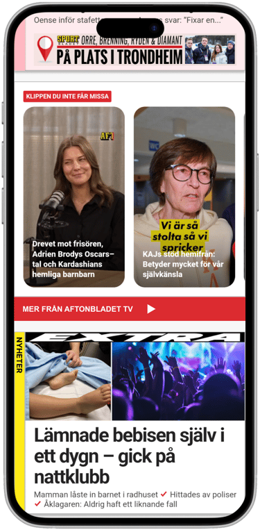
During this stage we also noticed that Aftonbladets path to their TV section was somewhat hard to find.
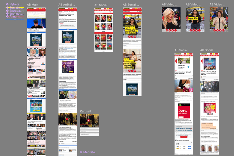
Iterate & Final prototype
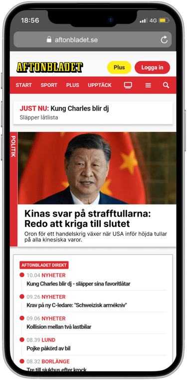
After our first round of testing we found some room for improvements, so we made another prototype focusing on a more structured homepage with grouped, color-coded articles and related content.
A clear path to Aftonbladets TV section.
A clear “Social” hub to guide users from TikTok/Instagram directly into articles.
Personalization for users and more transparent Plus value.
Less intrusive advertising and videos and improved layout.


Results & reflection
Insight: Aftonbladet attracts young users through social media speed, but loses them due to clutter and paywalls.
Key balance: fast news + credibility in design and content.
Iterative prototyping and testing helped shape solutions that fit both quick news consumers and users seeking depth.
Personally, I learned how user-centered research (surveys, interviews, testing) is essential to navigate diverse needs within the same target group.