Fast & Fresh
UI-Design & Branding
Challenge
Design a mobile-first food delivery app concept with a strong brand identity, clear UI guidelines, and a seamless shopping experience.
My approach
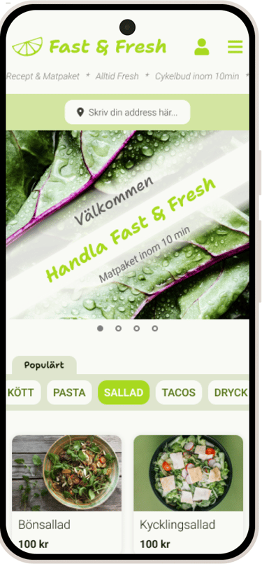
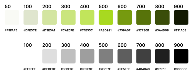
Defined a visual identity with a fresh, sustainable feeling through color palette, typography (Roboto + Shantell Sans), and consistent spacing scale.
Created a full design system: spacing rules, typography hierarchy, color scales (primary + neutrals), and reusable UI components.
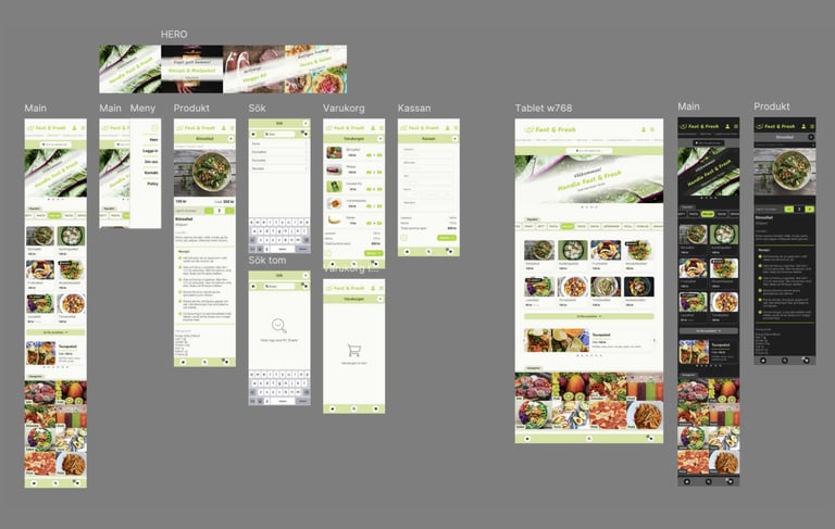
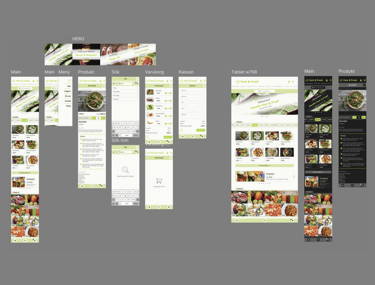
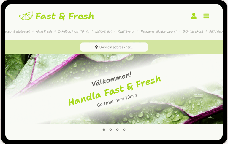
Designed key user flows: homepage, product pages, search (with empty states), cart, checkout, and responsive tablet views.
Explored dark mode design to ensure flexibility and accessibility.
Applied principles of consistency, clarity, responsiveness, and readability, while balancing negative space and branding.
The solution
A mobile app design that communicates freshness and simplicity, with:
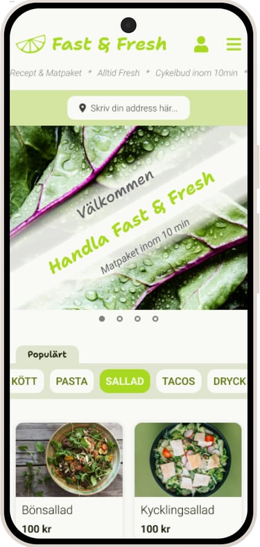
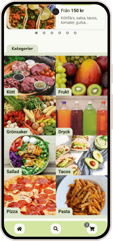
A clean, structured homepage with quick access to popular items.
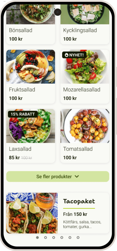
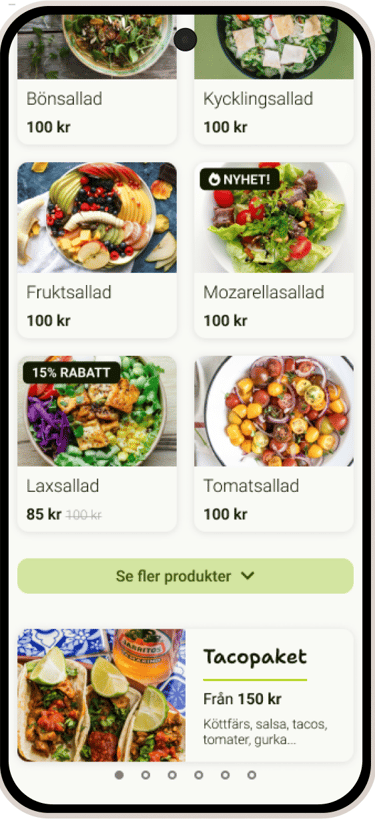
Product cards with clear hierarchy, price, recipe info, and nutrition values.
Smooth cart and checkout flows with emphasis on clarity and ease of use.
Responsive design for tablet and a dark mode version.


Reflection and learnings
Learned the importance of consistency in components and systematic use of spacing, fonts, and colors.
Would have liked to experiment more with the color palette and conduct more competitor research.
Gained confidence in using Figma to create structured, scalable UI design systems.